
Zlatka, don't complicate things, there's a hurry! - Calligraphy mistakes
Mistakes are part of the learning process in calligraphy, so they are nothing to be ashamed of. Accuracy is not a given. It is learned through practice, through making concrete products and through self-evaluation. We need to be sufficiently, but not too, self-critical.
Regular practice is the key to progress in calligraphy. So don't just throw away old practice sheets because you're not completely satisfied with the result.
It is progress that matters, not perfection. You will always find new ways to improve.
So keep the old exercise sheets and compare them in a few months' time with the fresh ones when you have made progress. The difference will be obvious.
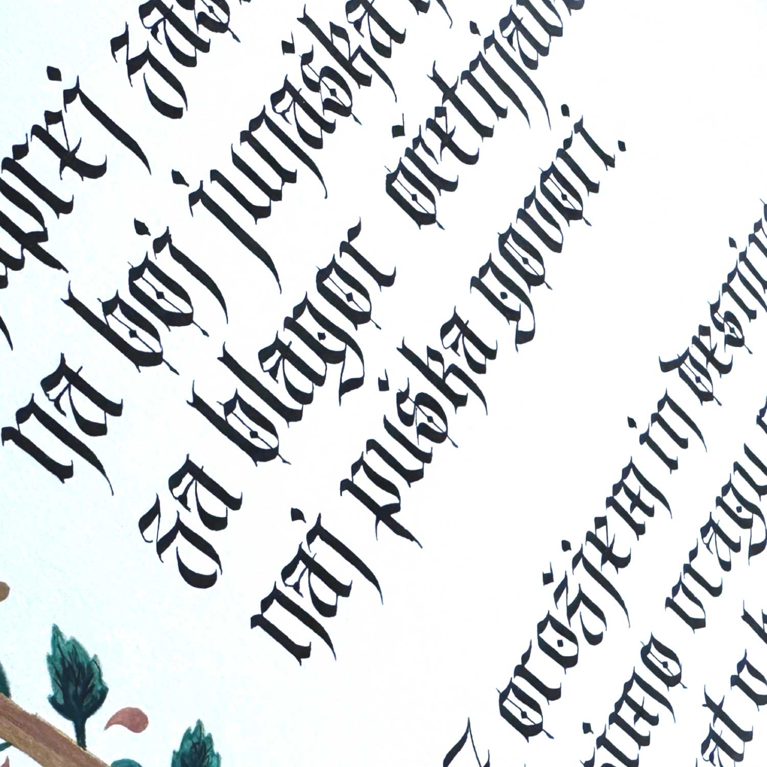
Retreating into precision, patience and calm
Calligraphy, the ancient art of beautiful writing, has been around for centuries in cultures all over the world. From Chinese and Japanese calligraphy to Arabic and Latin, each tradition brings its own unique techniques, tools and aesthetic principles. Calligraphy can replace a painting or blend perfectly with many painting techniques. Despite cultural differences, calligraphy has one common characteristic - precision. You can call it precision consistency, regularity, thoroughness... whatever suits you best.
Why is accuracy crucial?
Calligraphy is not just writing, but visual art that combines aesthetics, symmetry and harmony. Calligraphy skills have been highly valued throughout history. In ancient China, calligraphers were highly respected and their work was valued as an expression of intellectual and artistic excellence. Precision in calligraphy is not only about aesthetic perfection, but also about respect for tradition, culture and history. Calligraphy requires years of practice and patience, as the calligrapher must master technique, control tools and materials, and understand the importance of space and composition. Each stroke, no matter how small or subtle, contributes to the overall work of art, so precision is key to achieving the harmony and beauty that calligraphy brings.
Precision and consistency in calligraphy are not achieved overnight.
It takes long practice, repetition and attention to detail. Every move must be meticulously planned and executed. But it is through this process that we learn what is sorely lacking today - patience.
Today's pace is so fast-paced that children have so many leisure activities that it's hard to stay focused. Adults are in a hurry too. From work to home, dropping all the kids off at their activities and then they have to take care of themselves and their activities. They jump from hobby to hobby. This Saturday gardening, next Saturday crochet, Tuesday painting workshop, Thursday clay, Friday meditation... And then somewhere in between a bit of calligraphy.
For many, calligraphy is too complex to deal with lines, strokes, proportions and to persist beyond a three-hour Saturday workshop. But calligraphy can offer you more than a three-hour escape. Calligraphy is a journey of a thousand strokes.
"Some find their way in calligraphy, others their patience,
which is a real superpower in the world of instant gratification."

Cotton bag with calligraphic inscription
Rushing calligraphy is not worth it
Speed and calligraphy do not go together. I recently had to finish a project in one day because of a coordination that took longer than expected.
Sometimes even an acquaintance says to me:
"Zlatka, don't complicate things, we're in a hurry!"
Let's take our time with calligraphy. We need enough time for each product. From conceptual design, through validation, production, final checking and any corrections. Last but not least, the ink needs to dry before our product can go out of hand. But believe me, I have also dried ink with a hairdryer. I definitely advise against that. If you want to know why, go ahead and try this stupid thing.
Multitasking, or multitasking, is bound to lead to poorer results. When a client wants a product in a few days, I prefer to refuse, because sometimes the ink takes too long to dry. Especially on rainy days when there is a lot of humidity.
My eyes are also tired from hours of calligraphic engraving. I also use a magnifying glass for smaller type.
These bottles in the photo below took me 8 hours to engrave. Of course, you don't see all the text. I also engraved the names and surnames on the side of the bottle, which were very long, sometimes double. I am not showing them here because of GDPR. Only the front lettering in Latin is visible.
Calligraphy engraving is a time-consuming process as the drill bit is not flexible like a calligraphy point and therefore leaves only an even trace. Calligraphy, however, is characterised precisely by its contrasts of thin and broad strokes.
When engraving I also wear respiratory and eye protection, as glass dust is harmful and irritating to the skin.
- First, I make a draft of the look.
- I specify the font size.
- I draw the lines.
- I write a draft in marker or glass pencil.
- I am engraving for the first time.
- I clean the bottle of any residual glass powder.
- I engrave a second time, widening only part of the stroke that a calligraphic pen would make wider, because it is split. You could say it is a 'faux calligraphy'. But it is not true calligraphy without the knowledge of real calligraphy.
- I clean the bottle again.
- Coat the engraving with a durable gold paste.

Hand-engraved commemorative bottle
Moisture also affects calligraphy results
In spring, when there is a lot of rain and high relative humidity, writing is very difficult. Hands stick to paper, ink does not flow smoothly and takes too long to dry. Air-conditioning can help to create the right conditions for writing. Proper room preparation and the use of gloves or long sleeves can prevent the hand from getting stuck to the paper.
The most common mistakes made by calligraphy beginners
1. Skipping the basics
Many beginners skip the basic skills and go straight to the complicated elements. Any learning of a new skill requires learning the basics gradually and then the more difficult elements. In calligraphy, it is also extremely important to first master the basic strokes and the correct posture of the body and pen. This will help you develop a solid foundation for progress.
2. Suspension of the use of leading lines
Leading lines are essential for evenness and consistency in calligraphy. Without them, letters can become uneven and messy. Leading lines help to maintain the correct size, pitch and spacing of letters, which is key to aesthetic appeal.
There are horizontal and vertical guide lines. For one line of calligraphy we need 4 horizontal lines. Additional ones for the height of the figures. The vertical ones dictate the slope of the font, which can be perfectly vertical at 90 degrees or at a certain slope. Different fonts are written at different slopes. Even within a single font, several different gradients can be alternated. Of course, you can experiment and change the slant slightly, developing your own unique style.

Leading lines for Copperplate calligraphy.

The leading lines for the calligraphic notation have not yet been consulted.
3. Incorrect choice of calligraphic tools and materials
Using the wrong calligraphy tools can have a significant impact on the final result. The right tools for a particular style of calligraphy are essential. You can find various calligraphy kits online that are incorrectly assembled. For example, for calligraphy written with a pointed nib, you would not use a wide nib. The correct choice of tools makes the work easier and improves the end result.
This does not mean, however, that you should not dare to write Italian with a pointed nib, even though it is traditionally written with a broad, clipped nib. Experimentation is encouraged, but it is good to know the rules beforehand, because that way you can adapt them in a really innovative and creative way.
The choice of paper also plays a big role. Even if you are just practising, I advise against regular 80g printer paper, as the ink will spill badly and you will be convinced that it is too heavy for you and that you are no good at it. I recommend Color Copy 120g paper or acid-free papers designed for calligraphy
Read more about calligraphic materials Here.

This set that I found online is incorrectly assembled. With the Post - Oblique pen, we never use the clipped tips for calligraphy.

Color Copy 120 g/m2 - paper used in my calligraphy courses.
4. Incorrect posture, position and alignment
Three important P's (posture, placement, position - posture, positioning, position) are often neglected, but have a huge impact on your work. Incorrect posture can cause fatigue and pain, which affects the accuracy of your moves. Correct posture and a comfortable working position allow you to move your hand better. The position of the paper on the work surface is also important for optimum results.
I recommend watching the full video of the correct calligraphy seating position, as beautifully demonstrated by Paul Antonio
5. Incorrect error correction
Mistakes happen, but the important thing is how to correct them. For fresh errors you can use a paper towel to blot off the excess paint.
When the fault is already dryyou can use a thin brush and water to gently remove the pigment. you can use a light colour in the shade of the paper and cover the defect.
Dry ink can be repaired by carefully scraping with a knife or scalpel. It is important to learn how to correct mistakes correctly without damaging the paper.
Tips for avoiding writing mistakes
Through practice, I have also categorised errors according to their causes, which are manifold.
- Grammatical errors, missing letters and repeated words: They can happen because the template is wrong, or because the text is not proofread, translated or transcribed correctly. To avoid this, we need to be completely focused when we work. The picture below shows how I broke it while writing.
I got the first few copies right, but then unknowingly changed the wording to the wrong one as I was writing. Of course, because when you write the same text, you get "spoiled" and don't check the text. Immediately, the head and the hand go off on their own. I made 10 wrong copies. It was a good thing that the transparent paper cover was just wrapped around the card and I could change it.

The original spelling would read: Herzlichen Glückwunsch or Herzliche Glückwünsche
- Uneven letter spacing: These errors happen when our space between the letters is not uniform throughout the text. Each calligrapher has his own style of writing, but it is beautiful if there is a noticeable consistency of writing throughout the piece.
- Wrong slant, poor letter shape: Incorrect letterforms can be caused by incorrect pen posture and the wrong angle at which the nibs are held, failure to use leading lines, inconsistency or uneven pressure when writing. I also advise against changing pens while writing a product, as the new pen may make the writing slightly nicer, thinner, the edges of the strokes sharper and the difference very obvious.
- Paper fibre errors: They are mainly produced when writing with a pointed pen on handmade paper. It must be properly prepared before writing so that the pen does not get stuck in the paper fibres.

I didn't use a marker for this lettering, the pen got stuck in the paper fibres, so the strokes are not properly thin/wide. Do you notice any mistakes?
- Unbalanced decoration - Flourishing: We learn to decorate when our handwriting is already well formed. Let's follow the rule that the decoration must not interfere with the legibility of the text, it must be balanced. The correct way to decorate in Copperplate is to stick to the ovals, not to decorate finely, and to do it in a planned and not spontaneous way.
A friendly hint on errors
Mistakes happen. Some are fixable, others require a fresh start. Mistakes on paper are not that costly, except when it comes to handmade paper or a precious object. Digital calligraphy is more forgiving of mistakes, it is quicker to reproduce, although I sometimes find it harder to write. The surface of the tablet does not give feedback on the wear or the correct density of the ink as I am used to with pen writing.
To avoid mistakes, I like to involve someone else as an outside observer, when I'm writing a text. Most of the time it is my husband Gabrijel.
I need a fresh pair of eyesbecause when I know the text almost by heart, and I know what I have to write, I stare at the product for so long without noticing the mistakes. It is only when someone with fresh eyes looks at the text that they will spot the mistake, and much more quickly. That is why I suggest that you check the text with someone already in the draft.
A few days ago, Urša so sympathetically pointed out to me some mistakes in the text I had sent for the exercise. She wrote:
"Hello, Zlatka!
I thank you once again for the workshop, I am really grateful that you gave us your knowledge.
I miss Tuesdays.
Thank you also for this message and the exercises in it. I am just practising a little. I printed it out on traditional paper, it's desperate to write because the pen just tears it up. Now I have experienced how important it is to use the pen for the exercise as well. good paper.
Only good on purpose, a few grammatical errorsthat the following are correct: sh is missing a dash, life is missing an a and not an e, j is missing a dot - suffix.."
More heads know more, more eyes see more.

Urša - Uva corrected my mistakes so sympathetically. I will send a new text to the course participants for practice, and I will correct the typos in this post as I go along. I have discovered that I have a kind of "typing dyslexia".
I did get some good feedback on the course, which will improve my workflow even more. So Zala made an excellent suggestion, to mark each letter individually in plain print, so that those that are more complex or ornate leave no doubt as to which letter is being discussed. I have thought about this when I was learning from foreign literature and the letters were not clearly marked.
“Writing calligraphy is like a dance of the hand and the heart. Only the most patient master the shallow steps."
No Comments