December had a really good vibe. Not because the calendar was approaching the end of the year and promising days off, but because something was in the air. The city became a backdrop, cafés smelled of kuhanka, cinnamon and baking cake. Perhaps we even allowed ourselves to be more human.
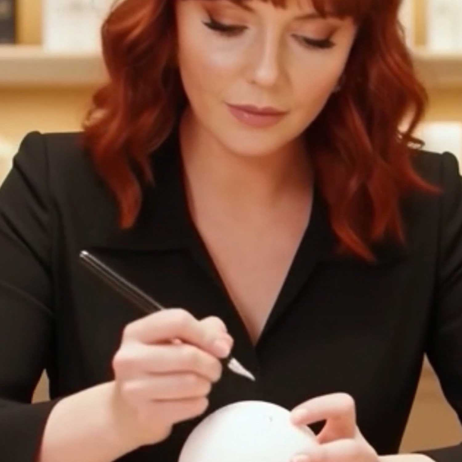
And it was in such a fragrant December that I spent most of my days this year. Between the smell of perfume, the rustle of gift paper and the quiet sighs of people as they saw their name being calligraphed in real time. It was intense, inspiring and surprising.
During the peak festive season, I had the honour of doing live personalisation for some well-known brands, and together with some of them we discovered that calligraphy is not as simple as it looks at first sight.
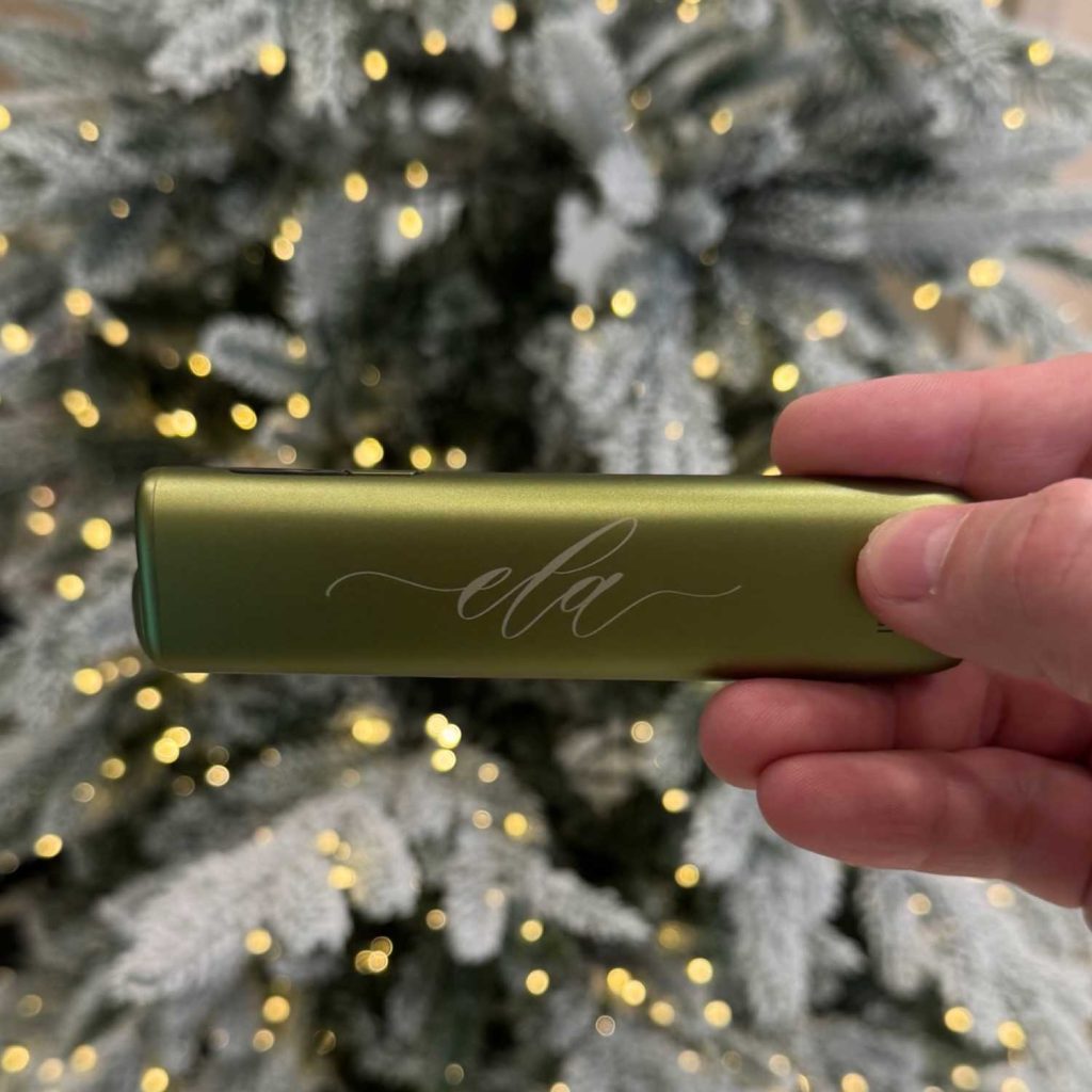
Personalising fragrances with calligraphy engraving for Victoria's Secret
By calligraphically engraving the fragrances, I turned each product into a memory and a personal message. Calligraphy with a touch of gold paste makes it even more accentuated.
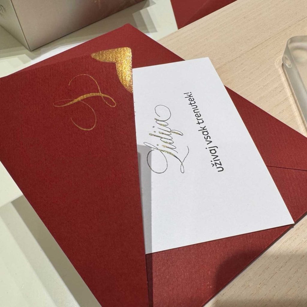
Calligraphic dedications and digital calligraphy
Calligraphy with a combination of two technologies: the name written in real calligraphy alongside the motivational message and digitally written for a perfect look of laser-engraved personalisation on the product. All live, in front of the customers.
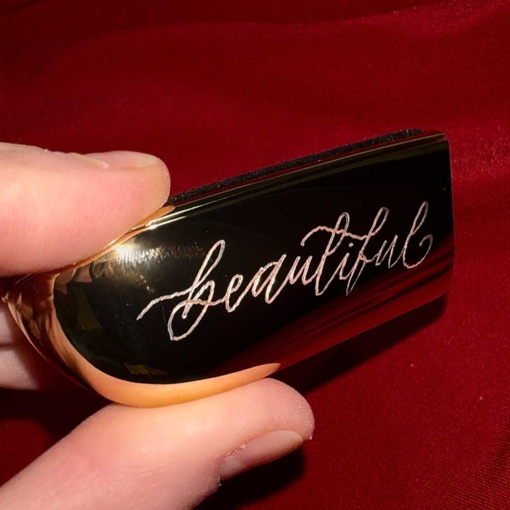
Engraving for Guerlain
Buyers of these beautiful lipsticks, complete with a prestigious case, can choose to have their name, initials or a one-word message engraved. Personalisation on the spot in less than a minute. “Voilà. ”Calligraphy with a combination of two technologies: the name written in real calligraphy alongside the motivational message, and digitally inscribed for the perfect look of laser-engraved personalisation on the product. All live, in front of the customers.
Screenshot
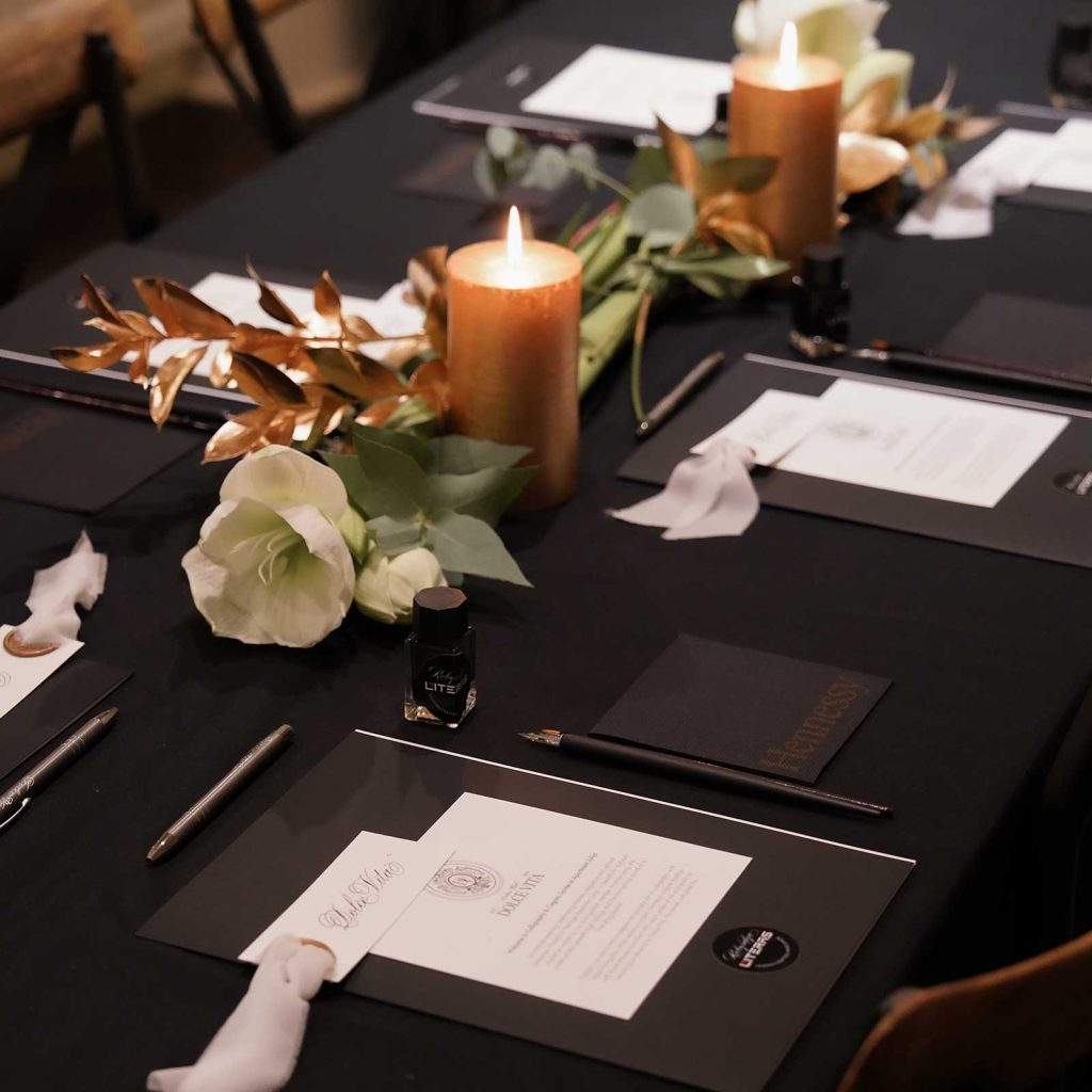
Cognac & Calligraphy Soiree in the Julija Apartment
An exclusive Dolce Vita Ladies Club evening with a tasting of timeless classic Copperplate calligraphy, accompanied by live classical music by the Pastel Quartet and Hennessy cognac. Club participants learned about the gracefulness of writing in the beautiful surroundings of an old bourgeois apartment in Ljubljana.
Photo by Agency La Maison Digitale - photographer Daria OsipovaPhoto by Agency La Maison Digitale - photographer Daria Osipova
Personalising gifts at a corporate party.
At an internal company event, I engraved the names of business partners and clients live on coffee cups. Each piece was created right in front of the recipient, personalised just for them. And became a special gift, not just another one. 72 cups were personalised in three hours. After the event, I received a really warm response: “Thank you, they are really beautiful products. Everyone was very impressed, so we will definitely do it again.”
These were experiences that deepened the relationship between the brand and its customers, turning each product into a personal story.
Why does live personalisation work?
The trend we see with international brands is clear: the festive season is no longer just a season of discounts, but an opportunity to create intimate, emotional experiences that connect customers to the brand on a deeper level. Such attractions are proven to increase engagement with both business partners and end customers.
The shopping experience no longer means:
product presentation,
explanation of functionality,
help you choose.
Increasingly, it is transformed into an experience based on humanity, on emotional contact and not just a transaction. Live personalisation through calligraphy makes this possible because:
puts the human being at the centre of experience,
reinforces the brand perception of being attentive and different,
turns the product into a personal experience,
increases customer dwell time and engagement,
It also enables a more personal relationship with business partners, who become part of the story and not just recipients of gifts.
Photo Blaž Žnidaršič
The most beautiful stories from December An elderly gentleman who was buying a present for his wife and heard my tool said, “But you write this by hand?” When I explained that it was hand-engraved calligraphy, he enthusiastically said, “I'm going to surprise her very nicely with that.”
Young visitor in the shop: “Wow, how nice. Mom, look what a nice M she made me. Look how beautiful it is.” A mother and daughter buying presents together: “But can I film how it's made? That will be a really great gift.”
A guest at a business event watched from a distance, then walked up, said her name and added that she wanted a heart next to her name: “I didn't imagine it could be done so quickly and so imaginatively.”
That is the charm of calligraphy. On the spot, there is a solution for a sympathetically designed inscription that would otherwise require additional design. But then the hand connects with inspiration and something that only the human mind can do is created.
What customers say, sometimes very quietly, “Wow, this is really top-notch. They've taken care of everything. They're really going for it.” Such micro testimonials are proof that people feel there is value beyond the product and the festive discount.
Opportunities for the development of experiential marketing in Slovenia
Market information A large part of the Slovenian market does not yet understand the difference between personalisation as promotion and personalisation as strategic experience. It is often the first time that event guests or customers see hand-engraved handwriting or calligraphy. This means that they are not buying a service, they are just encountering it.
The question is not whether you do it, but how often and with what aim. Instead of one-off opening or December activations, brands could consider recurring experiences that educate audiences. Slovenia is ready for more than trade.
Guests are especially impressed by the attractive calligraphy handles.
People want experiences, not just products Live personalisation builds emotional connections and memory. It's no longer just about sales.
If you are a brand or marketing team thinking about how to stand out from the average and create a truly memorable experience in 2026, I'd love to hear from you.
While global trends are constantly changing, one art form is always on trend - the calligraphy.
In Slovenia Zlatka Trstenjak Rampre business owner Literas calligraphy, one of the few that keeps this traditional art alive and dynamic. With its service live calligraphy and calligraphic engraving at events, takes personalisation to a new level.
Personalising a cosmetic mirror. Calligraphy by Zlatka Trstenjak Rampre
Elle dialog - Personalisation through engraved calligraphy. Photo by Aleksandra Saša Prelesnik/AML
"Live calligraphy is not just writing; it's a performance that allows guests to watch elegant strokes being created in real time," explains Zlatka, who has been doing calligraphy for 18 years, 11 of them professionally.
Service Pop-Up ART is a very popular service at events. Live calligraphy is attractive for its rarity on the corporate events, gala dinners, protocol meetings and weddingswhere hand-painted elements add a sense of exclusivity.
Hand-engraved glasses for a wedding gift. Calligraphy by Zlatka Trstenjak Rampre
Champagne KRUG and Zemono Manor 2024. Photo: Nejc Pernek Žiga Intihar
Why calligraphy?
Each event is a new symphony, in which Zlatka's calligraphy is as a melody that combines visual and thematic elements. Her art adapts to the style and soul of the event. This chameleon-like ability is crucial in protocol tasks, where the importance of detail cannot be overestimated and the readiness for last-minute changes is a must.
Golden calligraphy in books. Champagne KRUG and Zemono Manor 2024. Photo: Nejc Pernek Žiga Intihar
With extensive experience in in the field of protocol, maintains professional calm even in the face of unpredictable changes.
Although she would prefer to test the materials she writes on beforehand, she adapts to the fast pace of events and ensures that the calligraphy not only suits but also enhances the overall visual image. Her handwriting shows respect for tradition, but is also adapted to the times.
Foundations of the calligraphic art
Calligraphy is more than just beautiful writing; it is a discipline that requires years of learning and constant refinement. Every stroke of the pen is the result of a deep knowledge of composition, letter formation and the handling of tools that are often both traditional and innovative.
Calligraphy at prestigious events
At high-profile events such as state banquets, exclusive private receptions and gala dinners, calligraphy is not just an aesthetic addition, but part of the protocol that reflects the status of the event.
Zemono Manor
Zlatka also showed her calligraphy skills at the Zemono Manor. Fine cuisine and prestigious wines demand perfection in all the elements that come together on a fabulously decorated table.
Every guest of this exceptional evening in Inn at Lojzet's, received a book with a dedicationChef Tomaž Kavčič, ambassador of the prestigious Krug champagne. Zlatka handwrote the name of each recipient in gold calligraphy.
Champagne KRUG and Zemono Manor 2024 Photo: Nejc Pernek Žiga Intihar
The beautiful ambience of Zemono Manor. Champagne KRUG and Zemono Manor 2024 Photo: Nejc Pernek and Žiga Intihar
The parallels of the evening were clear - golden calligraphy intertwined with golden food and with champagne KRUG with gold leaf. In this way, a handwritten detail has become part of the overall experience of the dining experience.
Personalising a gift with gold calligraphy. Inscribing the names of the book recipients. Champagne KRUG and Zemono Manor 2024 Photo: Nejc Pernek and Žiga Intihar
Mastercard Pop-Up restaurant with chef Ana Roš
Event Mastercarda was a tribute to the art of creating with your hands and your heart. Zlatka is in Horn Centre co-designed the seating chart and name cards on the organiser's printed material. Her calligraphy shone in the beautiful surroundings and in the company of other artists' creations.
Rog Centre Photo Marko Delbello Ocepek
Calligraphy under the gentle glow of candlelight, was intertwined with elements of other artists, who together created harmony with the exquisite cuisine and unique ambience. Artistic Designed table textiles, carefully selected floral arrangements, unique ceramic tableware and calligraphy on printed materials completed the aesthetic whole of the event.
Calligraphy on name cards. Rog Centre Photo Marko Delbello Ocepek
Customer confidence
Zlatka is not just a calligrapher, she is a curator of spines who creates an experience with elegance. Her work is a testament to the power of presonalised art in action, when an event turns into an unforgettable story.
Her calligraphy has decorated numerous documents and gifts for prominent clients:
Ministry of Defence
Protocol of the Republic of Slovenia
Golf Bled
Marles
Zemono Manor
Mastercard Slovenia
Elle Slovenia
Wine Universe
Be.Vavie
Victoria's Secret
and many others
For Zlatko, who has been working in the field of calligraphy for more than a decade, it is not just a profession, but a a way of life. Her art combines aesthetics and functionality into a harmonious whole, elevating every event to a higher level.
In an age of digitalisation, when personal contact is increasingly rare, handwritten details bring warmth and personal attentionwhich no printing technique can replace.
Calligraphy is an ancient art that has impressed with its beauty and precision for centuries.
Nowadays, more and more things are being digitised. That's why hand calligraphy has become something special and unique. But there is often confusion and misunderstanding about what we are actually buying when we are looking for calligraphy. It is therefore important to have a clear understanding of the difference between real calligraphy, digital calligraphy, fonts and other forms of writing, and how much time and effort it takes to master this art.
Calligraphy course
The path to calligraphy mastery
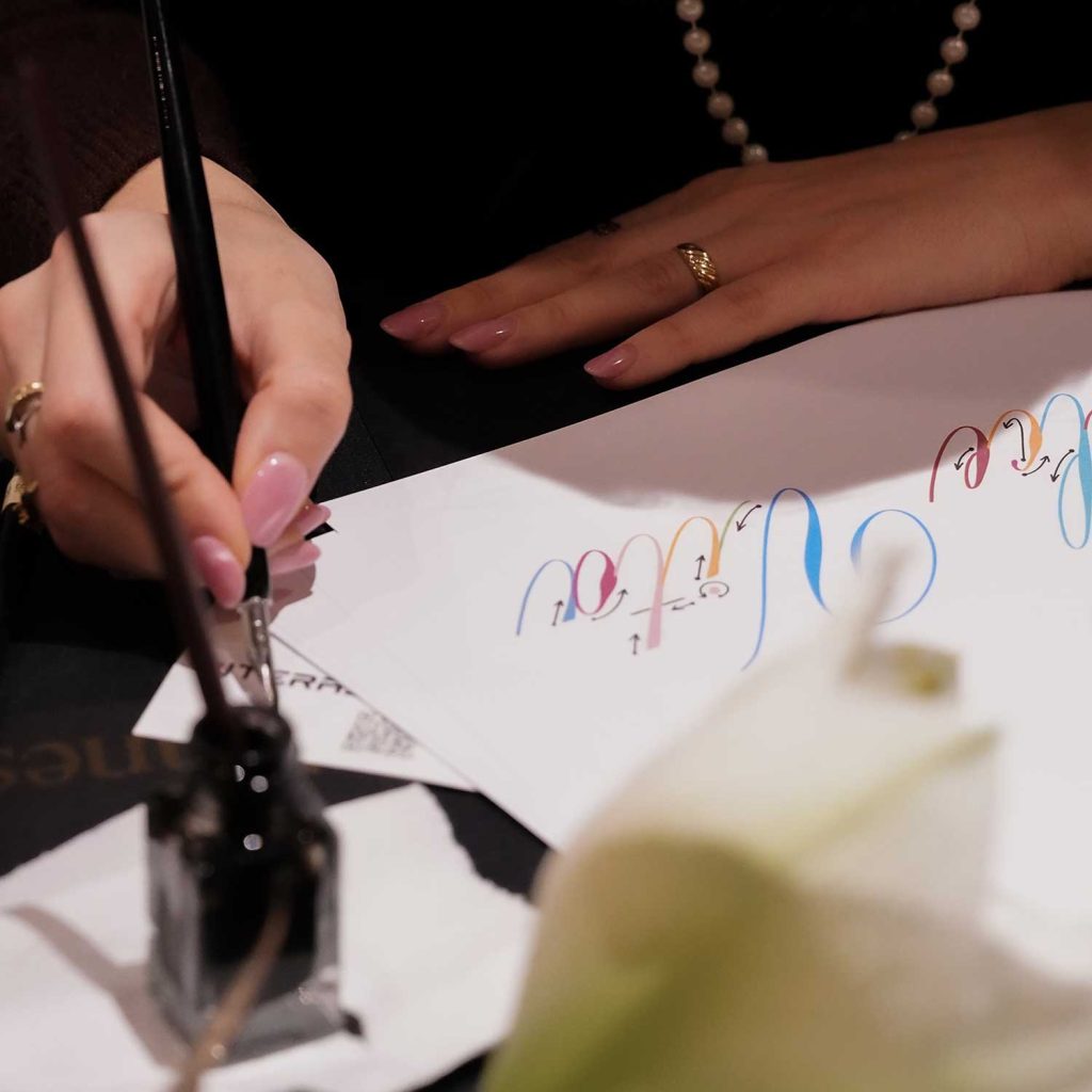
When you start learning calligraphy, you quickly realise that it is a skill that requires much more than just beautiful handwriting. In fact, it is not even necessary to learn calligraphy. In fact, calligraphy involves many layers of learning, from the correct control of the pen, to sitting posture, to the basic strokes, to forming the letters and connecting them into coherent words and sentences. Every stroke, every turn and every detail has its own meaning and contributes to the overall image of the text.
In calligraphy, it is also necessary to learn the correct proportions and the correct pitches of a single script when exploring classical calligraphic scripts.We also use some basic mathematics.
Practice is the key to success. Developing muscle memory through regular practice allows hand calligraphy to become more and more natural and fluent. It is important to understand that each calligrapher develops his or her own unique style that reflects his or her personality and artistic expression.
How long does it take? If you want to learn the basics of calligraphy, you can reach a basic level in a few months with regular practice. To achieve mastery, especially in traditional styles such as Spencerian Italian, Gothic or Roman capitals, you will need years of dedicated work. Mastery is not only a technical skill, but also a deep understanding of the history of the typeface in question, of the forms, composition and expression through the script.
What is real calligraphy and what do you actually buy when you are looking for calligraphy?
True calligraphy is the art of handwriting with different calligraphic tools, where each stroke reflects the artist's mastery and precision. The use of different line thicknesses and dynamic strokes creates words that are not only aesthetically sophisticated but also rich in expression. Calligraphy can be traditional, where strict adherence is made to certain rules that have evolved over the centuries, or contemporary, where the artist explores new forms, experiments with spatial arrangements and adapts the style to his own needs and inner expressiveness.
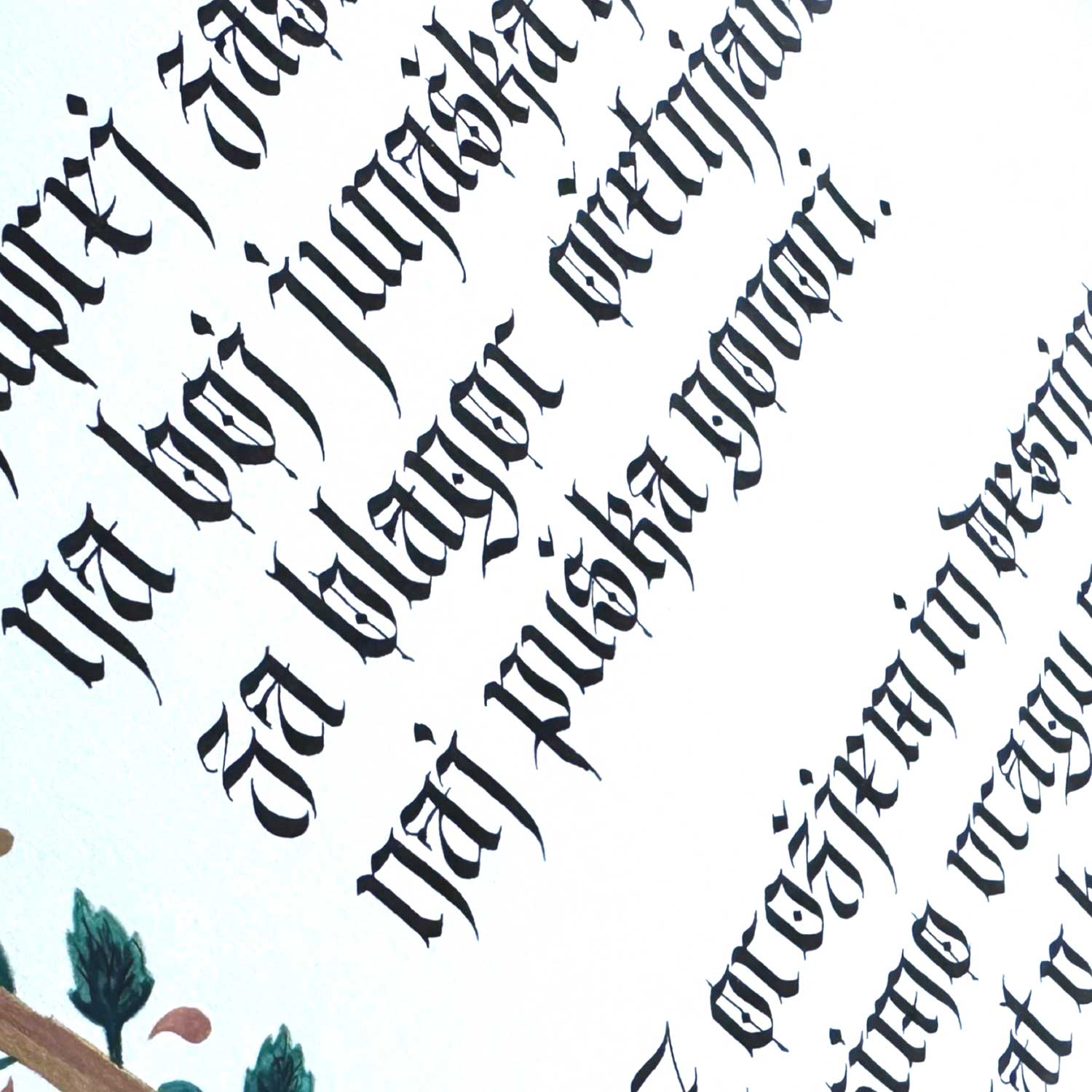
Calligraphy - Gothic
The influence of Dada in calligraphy is particularly present in contemporary approaches, where calligraphers depart from classical rules and focus on spontaneity, absurdity and subversion of established norms. Dada, as an artistic movement that challenged traditional values and aesthetics, encourages the exploration of new possibilities in calligraphy, where the letter can be a mere element of visual composition, without strict regard to legibility or meaning. Artists in spirit Dada use calligraphy as a means of expression that does not necessarily conform to conventional aesthetic values.
This process of creation, which combines traditional crafts and avant-garde approaches, requires a great deal of knowledge, skill and time, as the artist not only masters technical aspects of writing, but also understands and interprets deeper philosophical and artistic concepts.
Calligraphy legibility can therefore be completely subordinate to the artistic expression and purpose of the product - or it can be used as a means of communication, conveying a clear message, or, as in Dada, it will become part of a broader artistic composition, where the meaning of words may no longer be the central element, but merely part of a visual game.
Monograms are an art formwhere the initials of the first and last name are intertwined to form a single character, which often has decorative and symbolic value. Historically, monograms have been used as personal or family symbols, sometimes even as royal or noble seals. In modern monogram design, calligraphers are often faced with the challenge of legibility, as capital letters, especially in stylised scripts, are not always easily recognisable as they would be in a simple printed form. However, monograms do not only serve as functional inscriptions; they are often designed as visually appealing logos, where decorative value is more important than legibility. This interplay of lines and shapes creates unique patterns that exude personality and aesthetics, making the monogram more than just a symbol - it becomes a work of art.
It often happens that a client chooses a certain font for a monogram, but then gets confused by a specific letter that he cannot read and wants to change the font. However, it is important to understand that when adhering to a historically correct font, it is important to take into account its cultural and aesthetic significance. Such typefaces are often precisely designed with a particular style and historical context in mind, so adapting individual letters can compromise the overall design and its intent.
The key to calligraphy is understanding, what it is used for. If it is a monogram to serve as a symbol or decoration, stylisation is more important than legibility. In this case, the monogram is an artistic expression where an interplay of lines and shapes combine to form a visually appealing sign that is not necessarily easy to read, but carries aesthetic and symbolic value.
On the other hand, when we use printed materials to record information such as event times or telephone numbers, we need to consider the importance of good legibility.
We will not write such parts of the text in highly decorated fontsas this would reduce their usefulness and clarity. Instead, we opt for more simple, functional fonts that provide accurate and easy-to-read text. Thus, when choosing a font for a particular purpose, it is essential to always consider whether it is decorative or informative and to choose the style and approach accordingly. That is why calligraphy is more than perfect when combined with typography (computer fonts).
Digital calligraphy and handwritten fonts: what's the difference?
Also commonly used in the design world digital calligraphy, which in turn derives from true calligraphy. A calligrapher first writes the text by hand, then scans it and converts it into a digital image that can be used for a variety of purposes, such as printed materials, logos or other graphic elements. This form of work still retains all the characteristics of handwriting and is not simply a typed word.
On the contrary Italics or handwritten script created in a graphic design software often mimics the look of calligraphy, but it is not handmade. Although these fonts can be very beautiful, they cannot capture the subtlety and uniqueness that hand calligraphy brings. It is often the case that designers use the term "calligraphy" for something that is really just a computer font, even if that font is based on a handwritten script. Calligraphers also often create their own typography, which is really closer to actual calligraphy, but which is ultimately a typed text.
Water bottle with a name
"Lettering" and other forms of writing
In addition to calligraphy and digital calligraphy, there is "lettering" or tracing letters, spelling. It is the drawing of letters and words by hand, not with calligraphic pens but with other tools such as pencils, markers, brushes or digital tablets. Lettering is an art form that also requires a great deal of skill and creativity, but it differs significantly from calligraphy in that it does not use the pen and ink technique.
Lettering can also include "faux calligraphy", which in Slovenian would be translated as "fake calligraphy" or "false calligraphy". It is a technique where a normal pen (such as a ballpoint pen or felt-tip pen) is used to create the appearance of real calligraphy by manually adding thicker lines in certain parts of the letters where they would otherwise be naturally thicker if written with a calligraphy pen.
The aim of this technique is to create the effect of calligraphy without the use of specialised tools, making it accessible to a wider range of people, including those who may not have experience of real calligraphy.
The importance of understanding what you are buying
When ordering wedding stationery, invitations or other special projects, it's essential to know what you're actually buying. Hand calligraphy is much more than just an aesthetically pleasing record; it is the result of hours of dedicated work, precision and artistic skill. Every element you see on my products is first carefully handwritten, then converted into digital form for printing. When you order calligraphy prints, I can assure you that each piece reflects my personal effort and craftsmanship. Of course, for unique creations, we always retain the original calligraphy, for all copies. Then we avoid digitisation, which also adds more value to the individual copy.
When a designer sells you "calligraphy", make sure it is real calligraphy. If the designer is not a calligrapher or does not work with a calligrapher, then you are not getting calligraphy, you are just getting a font, a typeface, a typography that has the appearance of a handwritten script. It is important to remember that real calligraphy carries with it the soul and expression of the artist, whereas fonts and digital inscriptions are the product of an automated process.
Distinguishing between typing text and handwriting one of the key differences is spatial complexity. Typed text is usually very compact, with the letters evenly aligned and arranged in precise lines, allowing a lot of information to be written in a small space. In contrast, handwritten text, especially in calligraphy, requires much more space. Calligraphic writings are often more sprawling, involving broad strokes, varying line thicknesses and individually shaped letters, who need their own space to express themselves.
Comparison of typed text and calligraphy. Calligraphy and visualisation by Zlatka Trstenjak Rampre
In addition, calligraphers often incorporate other artistic elements such as flourishes, decorative patterns, initials and other aesthetic accessories, that enrich the overall design. These elements require additional space, which means that calligraphic notations usually need a larger format than simple typed text would require.
It is important to take this spatial relationship into account at the planning stage of a project, as it is often the case that a text that appears short and concise at first sight becomes much more voluminous in calligraphic form. Calligraphy is not simply the writing down of words, but an artistic expression where each element contributes to the overall composition. For this reason, more space must be allocated to allow the text to be correctly represented and for the additional visual elements to come into their own, creating a harmony between functionality and aesthetic value.
Value of manual work
In recent years, as a calligrapher, I have often faced the challenge of evaluating the handmade, especially through comparisons with typographic fonts and laser engraving. Is it really so difficult to understand that a handwritten font is tailored to the client in question? Not only is the handwritten text written only once and is therefore unrepeatable. The whole process of making and fulfilling the client's wishes, including communication about the product, is tailored to that client.
Hand calligraphy takes time, concentration and artistic skill. Every product I create is the result of years of learning and continuous improvement. If someone puts a price of EUR 0.50 on laser engraving, you really cannot expect that a handmade piece of work, which involves so much effort and personal expression, will be cheaper than typed text and the inclusion of an engraving machine or a printer. Such expectations devalue the art and the work that we as calligraphers put into each product.
Calligraphy is not a sprint, it's a marathon
While interest in calligraphy has grown in recent years, it is largely practised as a hobby. At a time when dopamine doses are within reach of a single "scroll" or key, it is hard to expect more young people to take up calligraphy as a profession. Calligraphy requires a lot of dedication and perseverance, as the results are not immediately visible. It takes time, patience and a lot of practice before the desired effects are achieved.
Calligraphic font Unciala
This process is similar to the preparation of an Olympic sprinter, who trains hard for four years to get a few seconds. In fact, it turns out that he is not only a sprinter, but also a marathon runner, as it takes long-term endurance and an unwavering will to reach the goal. Similarly, in calligraphy, the road to mastery is long and requires more than instinct gratification. In this context, the challenge of our times is how to attract young people to an activity that requires so much dedication and perseverance, when there are so many other routes to quick rewards.
Monograms and initials, although at first sight simple concepts, carry a rich historyspanning centuries, cultures and art forms. These sophisticated designs were more than symbols of identity - they were used to denote power, brand products and decorate personal objects with a touch of art. From ancient civilisations to modern wedding invitations, monograms and initials remain an eternal art form, appreciated for their elegance and functionality.
Literas monograms
At LITERAS We create modern monograms for various occasions such as weddings, birthdays, anniversaries and other special events. Monograms and initials adorn wedding invitations, greeting cards, gift wrapping and special occasion cards.
History of the monogram
Old World
Monograms first came into use in ancient Greece around 350 BC, where they were used by the rich and powerful as signatures and to mark coins. Monograms of this period consisted of the initials of the names of cities or rulers, often combined into a single, aesthetically sophisticated symbol. This practice allowed the issuer of a coin to be quickly and easily identified, which was important for trade and confidence in the currency.
In ancient Rome, monograms were used on coins and other official documents as a way to indicate authenticity and authority. Emperors often used monograms to underline their power and legitimacy. Emperor Constantine I is known to have used the Chi Rho symbol, made up of the first two letters of the Greek name of Christ - Chi (Χ) and Rho (Ρ), as a sign of his faith and victory.
Middle Ages
In the Middle Ages, monograms found their way onto coins and as a sign of power and authority. In the 6th century, they were used by Roman rulers to authenticate coins. In the 8th century, Charlemagne, one of the most powerful rulers in European history, began to use monograms to mark his authority over conquered territories. These monograms often adorned goods and other objects that illustrated his power and influence. Monograms thus became a symbol of royal power and authority.
While kings and nobles used monograms to mark their belongings, guilds and craftsmen also used them to sign their products. Monograms were often carved in stone, burnt into wood or stamped into metal to indicate the ownership and quality of the product. This practice continued over the centuries as monograms became synonymous with craftsmanship and pride in one's work.
Renaissance
The Renaissance brought a new wave of interest in art and science, which also influenced the development of monograms. During this period, monograms became more sophisticated and ornate, often incorporating intricate patterns and motifs. Monograms were used on everything from manuscripts to buildings, where they adorned frescoes and architectural details.
One of the most famous examples of Renaissance monograms is the by Albrecht Dürer, German artist and printmaker who used his monogram, consisting of the initials AD, as his signature on numerous works of art. Dürer's monogram became synonymous with quality and craftsmanship, cementing his place in art history.
Baroque and Rococo
In the period Baroque and Rococo the monograms have become even more ornate and lavish. Artists used intricate floral motifs, scrolls and embellishments to create visually appealing monograms. These monograms have adorned everything from manuscripts and books to furniture and textiles. Monograms from this period were often gold or silver, emphasising their prestige and wealth.
Victorian era
The Victorian era brought a new wave of interest in monograms, which became popular in both England and the United States. Stylishly designed monograms adorned everything from parasols to prams and were a way for society ladies to recognise their own jokes in their wardrobes. Monograms also played a practical role during the American Civil War, helping military commanders identify their belongings among hundreds of blue and grey uniforms.
In this era, monograms became a symbol of prestige and status. Wealthy individuals often used monograms on personal items such as tablecloths, silverware, furniture and even clothing. Monograms were often made with intricate embroidery or stamped into metal, emphasising their elegance and sophistication.
Victorian alphabet, Monograms and names
Monograms in calligraphy
Calligraphy, the art of beautiful writing, has always been closely linked to the development of monograms and initials. The precision and creativity required for calligraphy naturally extend to the production of monograms. Over time, calligraphers have developed a variety of styles, from the ornate florid monograms of Victorian style to the clean lines of modern minimalism.
Monogrammed seal. Calligraphy and visualisation by Zlatka Trstenjak Rampre
Monograms have evolved over the centuries, adapting to different artistic styles and techniques. In the 19th century, engravings and printing processes were popular and enabled the mass production of monograms. This period also saw the development of new materials such as gold and silver, which were used to produce monograms on precious objects.
Museums dedicated to calligraphy, such as the Museum of Calligraphy in Moscow, show stunning examples of monograms and initials from different periods and regions. These institutions preserve the heritage of calligraphy and offer insights into the artistic development of monograms. See examples from the Fitzwilliam Museum collection.
The evolution of monograms over the centuries
Monogramshave taken on different forms and graphic styles over the centuries, serving a wide range of functional purposes. Almost all kings and nobles were proud of their monograms; for peasant families they were valuable hereditary family marks that later appeared in coats of arms and heraldry; makers used these marks to sign their creations, and so on. Today, many commercial companies from all areas of the world use monograms as the centrepiece of their visual identities under the name of logos.
One of the important aspects of monograms is their adaptability to different cultural, social and technological changes. Throughout history, monograms have undergone many transformations, adaptations and innovations that have enabled them to remain relevant and appreciated over time.
In the Middle Ages, monograms became an important symbol of power and identity. Rulers and nobles used monograms on their seals to indicate their ownership and the authenticity of documents. Seals were often engraved in metal or carved in stone to ensure the durability and integrity of their message.
One of the most famous examples of monograms from this period is the seal of the Emperor Charlemagne, used to certify official documents and agreements. Charles's monogram became a symbol of his authority and influence, contributing to his legendary status in European history.
Monograms in art and architecture
Monograms have also played an important role in art and architecture. In the Renaissance, artists used monograms to sign their works, which made their creations recognisable and authentic. Monograms were often incorporated into decorative elements of architectural details such as frescoes, stained glass and reliefs.
In the Baroque and Rococo periods, monograms became even more ornate and intricate. Artists used various techniques such as gilding, engraving and embroidery to create visually appealing monograms that adorned palaces, churches and other important buildings. Monograms from this period were often a symbol of wealth and prestige.
Monograms in modern times
With the advent of the Industrial Revolution and mass production, monograms found their way into everyday life. They were used on products ranging from clothing and textiles to furniture and jewellery. Monograms became popular among the middle class, who wanted to emulate the richer classes of society.
In the 20th century, monograms became an important part of the fashion world. Famous fashion houses such as Louis Vuitton, Chanel and Yves Saint Laurent used monograms as part of their branding. Monograms became a symbol of prestige and elegance that was appreciated by fashion enthusiasts all over the world.
Monograms today
Today, monograms are still popular and appreciated for their timeless elegance. They are used on a variety of products such as wedding invitations, special occasion gifts, clothing and accessories. Modern monograms often incorporate bright colours, intricate fonts and modern elements to adapt them to current fashion trends.
Monograms have also become an important part of the modern visual identity of companies. Many logos include monograms to symbolise the brand and its values. This symbolic form communicates with the audience on a deeper level, combining tradition and modernity in a single visual expression.
Monograms of the royal families, still in use today, are a wonderful reminder of a rich history and tradition that has remained almost intact over the centuries. These elegant symbols, often interwoven with coats of arms and crowns, carry a touch of a magical world where princesses and princes still live their fairy tales. Although the modern world has in many ways changed royal protocols and customs, monograms remain enchanting and retain their traditional aesthetic, reflecting the grandeur and the prestige of royalty. These sophisticated emblems tell a story of unchanged elegance and nobility, transporting us back to a time of mansions and balls, where the magic still lives on.
Monograms and initials in contemporary calligraphy
In modern times, they are monograms and initials find their place in calligraphy and design. Modern calligraphers use monograms to create unique and personal works of art. Monograms are popular for wedding invitations, special occasion gifts and other personalised products.
Monograms and initials have played an important role in art, culture and society throughout history. From ancient civilisations to modern design trends, monograms have remained a symbol of identity, power and beauty. Their adaptability to different techniques, styles and materials has kept them relevant and appreciated throughout time.
Monograms remain an important part of our visual language because of their universal appeal and timeless elegance.
Mistakes are part of the learning process in calligraphy, so they are nothing to be ashamed of. Accuracy is not a given. It is learned through practice, through making concrete products and through self-evaluation. We need to be sufficiently, but not too, self-critical.
Regular practice is the key to progress in calligraphy. So don't just throw away old practice sheets because you're not completely satisfied with the result.
It is progress that matters, not perfection. You will always find new ways to improve.
So keep the old exercise sheets and compare them in a few months' time with the fresh ones when you have made progress. The difference will be obvious.
Retreating into precision, patience and calm
Calligraphy, the ancient art of beautiful writing, has been around for centuries in cultures all over the world. From Chinese and Japanese calligraphy to Arabic and Latin, each tradition brings its own unique techniques, tools and aesthetic principles. Calligraphy can replace a painting or blend perfectly with many painting techniques. Despite cultural differences, calligraphy has one common characteristic - precision. You can call it precision consistency, regularity, thoroughness... whatever suits you best.
Why is accuracy crucial?
Calligraphy is not just writing, but visual art that combines aesthetics, symmetry and harmony. Calligraphy skills have been highly valued throughout history. In ancient China, calligraphers were highly respected and their work was valued as an expression of intellectual and artistic excellence. Precision in calligraphy is not only about aesthetic perfection, but also about respect for tradition, culture and history. Calligraphy requires years of practice and patience, as the calligrapher must master technique, control tools and materials, and understand the importance of space and composition. Each stroke, no matter how small or subtle, contributes to the overall work of art, so precision is key to achieving the harmony and beauty that calligraphy brings.
Precision and consistency in calligraphy are not achieved overnight.
It takes long practice, repetition and attention to detail. Every move must be meticulously planned and executed. But it is through this process that we learn what is sorely lacking today - patience.
Today's pace is so fast-paced that children have so many leisure activities that it's hard to stay focused. Adults are in a hurry too. From work to home, dropping all the kids off at their activities and then they have to take care of themselves and their activities. They jump from hobby to hobby. This Saturday gardening, next Saturday crochet, Tuesday painting workshop, Thursday clay, Friday meditation... And then somewhere in between a bit of calligraphy.
For many, calligraphy is too complex to deal with lines, strokes, proportions and to persist beyond a three-hour Saturday workshop. But calligraphy can offer you more than a three-hour escape. Calligraphy is a journey of a thousand strokes.
"Some find their way in calligraphy, others their patience,
which is a real superpower in the world of instant gratification."
Speed and calligraphy do not go together. I recently had to finish a project in one day because of a coordination that took longer than expected.
Sometimes even an acquaintance says to me:
"Zlatka, don't complicate things, we're in a hurry!"
Let's take our time with calligraphy. We need enough time for each product. From conceptual design, through validation, production, final checking and any corrections. Last but not least, the ink needs to dry before our product can go out of hand. But believe me, I have also dried ink with a hairdryer. I definitely advise against that. If you want to know why, go ahead and try this stupid thing.
Multitasking, or multitasking, is bound to lead to poorer results. When a client wants a product in a few days, I prefer to refuse, because sometimes the ink takes too long to dry. Especially on rainy days when there is a lot of humidity.
My eyes are also tired from hours of calligraphic engraving. I also use a magnifying glass for smaller type.
These bottles in the photo below took me 8 hours to engrave. Of course, you don't see all the text. I also engraved the names and surnames on the side of the bottle, which were very long, sometimes double. I am not showing them here because of GDPR. Only the front lettering in Latin is visible.
Calligraphy engraving is a time-consuming process as the drill bit is not flexible like a calligraphy point and therefore leaves only an even trace. Calligraphy, however, is characterised precisely by its contrasts of thin and broad strokes.
When engraving I also wear respiratory and eye protection, as glass dust is harmful and irritating to the skin.
First, I make a draft of the look.
I specify the font size.
I draw the lines.
I write a draft in marker or glass pencil.
I am engraving for the first time.
I clean the bottle of any residual glass powder.
I engrave a second time, widening only part of the stroke that a calligraphic pen would make wider, because it is split. You could say it is a 'faux calligraphy'. But it is not true calligraphy without the knowledge of real calligraphy.
I clean the bottle again.
Coat the engraving with a durable gold paste.
Hand-engraved commemorative bottle
Moisture also affects calligraphy results
In spring, when there is a lot of rain and high relative humidity, writing is very difficult. Hands stick to paper, ink does not flow smoothly and takes too long to dry. Air-conditioning can help to create the right conditions for writing. Proper room preparation and the use of gloves or long sleeves can prevent the hand from getting stuck to the paper.
The most common mistakes made by calligraphy beginners
1. Skipping the basics
Many beginners skip the basic skills and go straight to the complicated elements. Any learning of a new skill requires learning the basics gradually and then the more difficult elements. In calligraphy, it is also extremely important to first master the basic strokes and the correct posture of the body and pen. This will help you develop a solid foundation for progress.
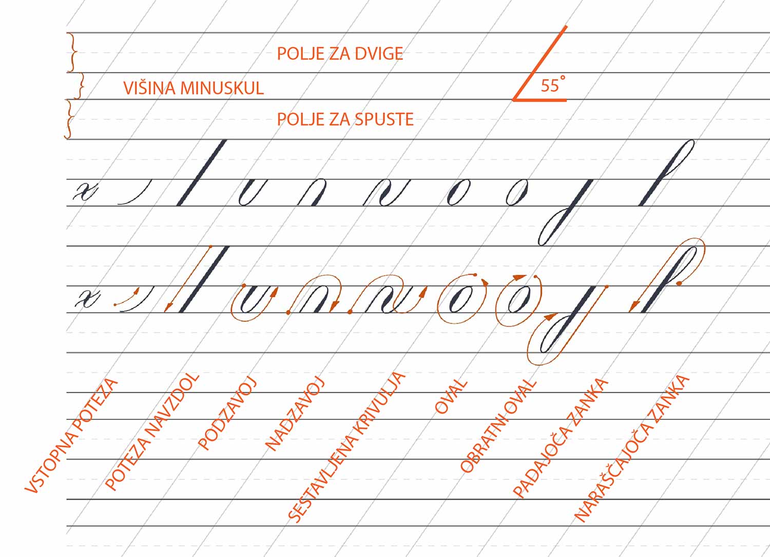
2. Suspension of the use of leading lines
Leading lines are essential for evenness and consistency in calligraphy. Without them, letters can become uneven and messy. Leading lines help to maintain the correct size, pitch and spacing of letters, which is key to aesthetic appeal.
There are horizontal and vertical guide lines. For one line of calligraphy we need 4 horizontal lines. Additional ones for the height of the figures. The vertical ones dictate the slope of the font, which can be perfectly vertical at 90 degrees or at a certain slope. Different fonts are written at different slopes. Even within a single font, several different gradients can be alternated. Of course, you can experiment and change the slant slightly, developing your own unique style.
Leading lines for Copperplate calligraphy.
The leading lines for the calligraphic notation have not yet been consulted.
3. Incorrect choice of calligraphic tools and materials
Using the wrong calligraphy tools can have a significant impact on the final result. The right tools for a particular style of calligraphy are essential. You can find various calligraphy kits online that are incorrectly assembled. For example, for calligraphy written with a pointed nib, you would not use a wide nib. The correct choice of tools makes the work easier and improves the end result.
This does not mean, however, that you should not dare to write Italian with a pointed nib, even though it is traditionally written with a broad, clipped nib. Experimentation is encouraged, but it is good to know the rules beforehand, because that way you can adapt them in a really innovative and creative way.
The choice of paper also plays a big role. Even if you are just practising, I advise against regular 80g printer paper, as the ink will spill badly and you will be convinced that it is too heavy for you and that you are no good at it. I recommend Color Copy 120g paper or acid-free papers designed for calligraphy
This set that I found online is incorrectly assembled. With the Post - Oblique pen, we never use the clipped tips for calligraphy.
Color Copy 120 g/m2 - paper used in my calligraphy courses.
4. Incorrect posture, position and alignment
Three important P's (posture, placement, position - posture, positioning, position) are often neglected, but have a huge impact on your work. Incorrect posture can cause fatigue and pain, which affects the accuracy of your moves. Correct posture and a comfortable working position allow you to move your hand better. The position of the paper on the work surface is also important for optimum results.
I recommend watching the full video of the correct calligraphy seating position, as beautifully demonstrated by Paul Antonio
5. Incorrect error correction
Mistakes happen, but the important thing is how to correct them. For fresh errors you can use a paper towel to blot off the excess paint.
When the fault is already dryyou can use a thin brush and water to gently remove the pigment. you can use a light colour in the shade of the paper and cover the defect.
Dry ink can be repaired by carefully scraping with a knife or scalpel. It is important to learn how to correct mistakes correctly without damaging the paper.
Tips for avoiding writing mistakes
Through practice, I have also categorised errors according to their causes, which are manifold.
Grammatical errors, missing letters and repeated words: They can happen because the template is wrong, or because the text is not proofread, translated or transcribed correctly. To avoid this, we need to be completely focused when we work. The picture below shows how I broke it while writing.
I got the first few copies right, but then unknowingly changed the wording to the wrong one as I was writing. Of course, because when you write the same text, you get "spoiled" and don't check the text. Immediately, the head and the hand go off on their own. I made 10 wrong copies. It was a good thing that the transparent paper cover was just wrapped around the card and I could change it.
The original spelling would read: Herzlichen Glückwunsch or Herzliche Glückwünsche
Uneven letter spacing: These errors happen when our space between the letters is not uniform throughout the text. Each calligrapher has his own style of writing, but it is beautiful if there is a noticeable consistency of writing throughout the piece.
Wrong slant, poor letter shape: Incorrect letterforms can be caused by incorrect pen posture and the wrong angle at which the nibs are held, failure to use leading lines, inconsistency or uneven pressure when writing. I also advise against changing pens while writing a product, as the new pen may make the writing slightly nicer, thinner, the edges of the strokes sharper and the difference very obvious.
Paper fibre errors: They are mainly produced when writing with a pointed pen on handmade paper. It must be properly prepared before writing so that the pen does not get stuck in the paper fibres.
I didn't use a marker for this lettering, the pen got stuck in the paper fibres, so the strokes are not properly thin/wide. Do you notice any mistakes?
Unbalanced decoration - Flourishing: We learn to decorate when our handwriting is already well formed. Let's follow the rule that the decoration must not interfere with the legibility of the text, it must be balanced. The correct way to decorate in Copperplate is to stick to the ovals, not to decorate finely, and to do it in a planned and not spontaneous way.
A friendly hint on errors
Mistakes happen. Some are fixable, others require a fresh start. Mistakes on paper are not that costly, except when it comes to handmade paper or a precious object. Digital calligraphy is more forgiving of mistakes, it is quicker to reproduce, although I sometimes find it harder to write. The surface of the tablet does not give feedback on the wear or the correct density of the ink as I am used to with pen writing.
To avoid mistakes, I like to involve someone else as an outside observer, when I'm writing a text. Most of the time it is my husband Gabrijel.
I need a fresh pair of eyesbecause when I know the text almost by heart, and I know what I have to write, I stare at the product for so long without noticing the mistakes. It is only when someone with fresh eyes looks at the text that they will spot the mistake, and much more quickly. That is why I suggest that you check the text with someone already in the draft.
A few days ago, Urša so sympathetically pointed out to me some mistakes in the text I had sent for the exercise. She wrote:
"Hello, Zlatka! I thank you once again for the workshop, I am really grateful that you gave us your knowledge. I miss Tuesdays.
Thank you also for this message and the exercises in it. I am just practising a little. I printed it out on traditional paper, it's desperate to write because the pen just tears it up. Now I have experienced how important it is to use the pen for the exercise as well. good paper. Only good on purpose, a few grammatical errorsthat the following are correct: sh is missing a dash, life is missing an a and not an e, j is missing a dot - suffix.."
More heads know more, more eyes see more.
Urša - Uva corrected my mistakes so sympathetically. I will send a new text to the course participants for practice, and I will correct the typos in this post as I go along. I have discovered that I have a kind of "typing dyslexia".
I did get some good feedback on the course, which will improve my workflow even more. So Zala made an excellent suggestion, to mark each letter individually in plain print, so that those that are more complex or ornate leave no doubt as to which letter is being discussed. I have thought about this when I was learning from foreign literature and the letters were not clearly marked.
“Writing calligraphy is like a dance of the hand and the heart. Only the most patient master the shallow steps."
Why does handwriting beat typing for thinking and learning?
Taken from an article by Jonathan Lambert
If you're like most modern digital enthusiasts, it's probably been a while since you took a moment to write by hand on paper. The tedious process of putting thoughts down, letter by letter, on paper is becoming history in our screen-centric world, where handwritten letters and Post-it notes have been replaced by text messages and typed shopping lists, or even lists in apps from well-known retailers.
Electronic keyboards bring clear benefits and efficiencies that have undoubtedly increased our productivity. Can you imagine having to write all your emails by hand? To keep up with trends, many schools are introducing computers at pre-school age, which means that some children learn the basics of typing before they learn to write by hand. This means that they can type, but they cannot independently structure letters on paper.
However, abandoning this slower, more tactile way of expressing oneself may come at a considerable loss, given the growing body of research revealing the surprising cognitive benefits of handwriting. Handwriting is beneficial for both children and adults.
Neuroscientists have found that handwriting involves complex coordination between motor and visual systems.
Studies show that writing the alphabet instead of typing leads to better and more sustained letter recognition and understanding in children. Handwriting also improves memory and the recall of these words, laying the foundations for literacy and learning. For adults, taking notes instead of typing during lectures leads to a better conceptual understanding of the material.
"Very important things happen during the physical experience of handwriting," says Ramesh Balasubramaniam, neuroscientist at the University of California, Merced. "It has significant cognitive benefits."
These benefits have long been recognised among some authors, including Jennifer Egan and Neil Gaiman, who handwrite their stories to stimulate creativity.
And scientists are investigating why handwriting has such good effects. Recent brain imaging research shows that the power of handwriting comes from the relative complexity of the process and how it forces different brain systems to work together to reproduce letterforms in our brains and on paper.
What does your brain "do" when you write?
Both handwriting and typing involve moving our hands and fingers to create words on the page. But handwriting requires much more precise coordination between the motor and visual systems. So it seems to engage the brain in deeper ways, to support the learning process. You could say that the pen is more powerful than the keyboard.
Handwriting is probably the most complex motor skill the brain can master, says Marieke Longcamp, Cognitive neuroscientist at Aix-Marseille Université.
Sophia Vinci-Booher, a neuroscientist at Vanderbilt University, explains the complexity of handwriting. "Your fingers must each perform different tasks to create a recognisable letter."
In addition, your visual system is constantly processing the formatting of this letter. With each stroke, your brain compares the letter in formation with mental models of letters and words, and adjusts the movement of your fingers in real time.
What do we have to lose if we give up writing?
The most obvious consequence of screens and keyboards replacing pen and paper could be the ability of children to learn the basic building blocks of literacy - letters.
In addition, the increased use of screens has a negative impact on children's health, leading to lack of exercise and an increase in visual impairment. The problem is more complex than it seems at first sight. Excessive use of digital devices can contribute to a lack of physical activity, which affects children's overall development.
My child spends too much time on the phone
Parents often grumble that their children are illiterate and spend too much time on their tablets or phones, without realising the irony of their words, because they are the ones who set the example and have the power to limit the use of digital tools.
It is parents who put a phone in the hands of a child, even an infant, laying the foundations for addiction to digital devices instead of encouraging healthier and more creative activities.
Children are the mirror of their parents and their behaviour strongly reflects the environment in which they grow up. Just as parents model the behaviour they want to see in their children, children unconsciously imitate their parents' habits and routines. If parents spend a lot of time on their phones, it is likely that children will also reach for digital devices rather than engage in more creative and active activities. This phenomenon can be seen all around us; on pavements and pedestrian crossings, it is common to see children crossing the road carelessly, absorbed in their screens, unaware of their surroundings.
Causes of ADHD and PTSD
Attention Deficit Hyperactivity Disorder (ADHD):
ADHD is a neurological disorder characterised by attention problems, hyperactivity and impulsivity. The exact cause of ADHD is unknown, but research suggests a combination of genetic and environmental factors. Heredity plays an important role, as children whose parents have ADHD often inherit the disorder. Environmental factors such as exposure to toxins during pregnancy, low birth weight and brain damage can also contribute to the development of ADHD.
Post-traumatic stress disorder (PTSD):
PTSD is a psychiatric disorder that develops after exposure to a severe traumatic event, such as a natural disaster, accident, violent attack or war. People with PTSD experience recurrent memories of the trauma, nightmares, severe anxiety and avoidance of situations that remind them of the event. Biological, genetic and psychological factors can increase the risk of developing PTSD. Prolonged exposure to stress and lack of support after trauma also contribute to the onset of this disorder.
Why is calligraphy also useful for children with post-traumatic stress disorder or attention deficit disorder?
Being aware of these causes can help parents understand the importance of creating a healthy environment for their children and limiting the use of digital devices in favour of more creative and active activities. Practicing calligraphy can be one such activity that not only reduces dependence on technology, but also has a positive impact on the cognitive function and emotional stability of children, especially those with ADHD and PTSD.
You can read more about this in the following studies:
Using your smartphone while crossing a pedestrian crossing. Recorded with dash-cam and not using a mobile phone while driving..
Such behavioural patterning has profound consequences for a child's development. Screen time reduces opportunities for learning through play and interaction with peers, which is crucial for the development of social skills and creative thinking. In addition, continuous exposure to digital devices can affect a child's ability to concentrate and perceive hazards in the environment, which is clearly demonstrated in situations such as jaywalking.
Parents have a responsibility to show by their own example a balanced attitude towards technology and personal interaction. By encouraging activities that involve direct communication, reading books and physical play, parents can help their children develop healthier and more balanced habits that will have a positive impact on their overall development.
Setting such an example is not only a parental duty, but also an opportunity to show children the importance of being present in the moment and caring for their surroundings.
Slowing down and processing information
For adults, one of the main benefits of handwriting is that it simply forces us to slow down. It is possible to type what we hear verbatim during a meeting or a lecture. But often we are not actually processing the information - we are just typing blindly. If we take notes by hand, we can't write everything down, so we have to process the information, write key words or phrases and use drawings or arrows to process ideas. This helps to keep the information longer in the memory.
Such links and integration are still possible in typing, but they need to be done more deliberately. And sometimes, of course, efficiency wins. When you are writing a long essay, it is of course much more practical to use the keyboard.
Looking to the future
So what will happen to humanity if we give up writing and leave everything to robots? We may lose some of the fundamental cognitive processes that allow us to learn and think at our best. While some countries are trying to keep writing classes in schools, it is possible that the next generation will rely solely on digital tools, possibly sacrificing some of our thinking potential.
We will have more free time. Excellent. But didn't they say the same thing about the washing machine? So why not spend some of that time on calligraphy?
Calligraphy and skills maintenance
For those of you who don't want to miss out on these valuable skills and want to stimulate your brain function, I invite you to visit my a shop where you can find kits for self-learning calligraphy. You can also find free trial, which is suitable for a pencil. So you don't have to go shopping first.
Calligraphy is not just an art, but also a great way to maintain mental sharpness and finomotor skills. You can even do certain exercises and most of the silent scripts with a simple pencil, without any special tools.
Modern calligraphy with colourful markers in spring colours.
Using digital tools
Balasubramaniam points out that we do not have to abandon digital tools altogether to harness the power of the handwriting. So far, research shows that writing with a pen on a screen activates the same brain pathways as writing with ink on paper. It is the movement that matters, not the finished product.
To provide you with the best experience, we use cookies to store and/or access information about your device. Consenting to these technologies will allow us to process information, such as browsing behaviour or unique IDs, on this website. Failure to consent or withdrawal of consent may adversely affect certain capabilities and features.
Functional
Always active
Technical storage or access is strictly necessary for the legitimate purpose of enabling the use of a particular service explicitly requested by the subscriber or user or for the sole purpose of transmitting a message over an electronic communications network.
Settings
Technical storage or access is necessary for the legitimate purpose of storing settings not requested by the subscriber or user.
Statistics
Technical storage or access used solely for statistical purposes.Technical storage or access used exclusively for anonymous statistical purposes. Without a subpoena, voluntary compliance by your ISP, or additional third-party records, information stored or obtained for this purpose alone usually cannot be used to identify you.
Marketing
Technical storage or access is necessary to create user profiles to send advertising or to track a user on a website or multiple websites for similar marketing purposes.